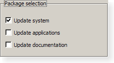
- class QGroupBox#
The
QGroupBoxwidget provides a group box frame with a title. More…Synopsis#
Properties#
alignmentᅟ- The alignment of the group box titlecheckableᅟ- Whether the group box has a checkbox in its titlecheckedᅟ- Whether the group box is checkedflatᅟ- Whether the group box is painted flat or has a frametitleᅟ- The group box title text
Methods#
def
__init__()def
alignment()def
isCheckable()def
isChecked()def
isFlat()def
setAlignment()def
setCheckable()def
setFlat()def
setTitle()def
title()
Virtual methods#
Slots#
def
setChecked()
Signals#
Note
This documentation may contain snippets that were automatically translated from C++ to Python. We always welcome contributions to the snippet translation. If you see an issue with the translation, you can also let us know by creating a ticket on https:/bugreports.qt.io/projects/PYSIDE
Detailed Description#
Warning
This section contains snippets that were automatically translated from C++ to Python and may contain errors.

A group box provides a frame, a title on top, a keyboard shortcut, and displays various other widgets inside itself. The keyboard shortcut moves keyboard focus to one of the group box’s child widgets.
QGroupBoxalso lets you set thetitle(normally set in the constructor) and the title’s alignment . Group boxes can becheckable. Child widgets in checkable group boxes are enabled or disabled depending on whether or not the group box ischecked.You can minimize the space consumption of a group box by enabling the
flatproperty. In moststyles, enabling this property results in the removal of the left, right and bottom edges of the frame.QGroupBoxdoesn’t automatically lay out the child widgets (which are oftenQCheckBoxes orQRadioButtons but can be any widgets). The following example shows how we can set up aQGroupBoxwith a layout:groupBox = QGroupBox(tr("Exclusive Radio Buttons")) radio1 = QRadioButton(tr("Radio button 1")) radio2 = QRadioButton(tr("Radio button 2")) radio3 = QRadioButton(tr("Radio button 3")) radio1.setChecked(True)
See also
Note
Properties can be used directly when
from __feature__ import true_propertyis used or via accessor functions otherwise.- property alignmentᅟ: Combination of Qt.AlignmentFlag#
This property holds the alignment of the group box title..
Most styles place the title at the top of the frame. The horizontal alignment of the title can be specified using single values from the following list:
Qt::AlignLeft aligns the title text with the left-hand side of the group box.
Qt::AlignRight aligns the title text with the right-hand side of the group box.
Qt::AlignHCenter aligns the title text with the horizontal center of the group box.
The default alignment is Qt::AlignLeft.
See also
Alignment- Access functions:
- property checkableᅟ: bool#
This property holds whether the group box has a checkbox in its title.
If this property is
true, the group box displays its title using a checkbox in place of an ordinary label. If the checkbox is checked, the group box’s children are enabled; otherwise, they are disabled and inaccessible.By default, group boxes are not checkable.
If this property is enabled for a group box, it will also be initially checked to ensure that its contents are enabled.
See also
checked- Access functions:
- property checkedᅟ: bool#
This property holds whether the group box is checked.
If the group box is checkable, it is displayed with a check box. If the check box is checked, the group box’s children are enabled; otherwise, the children are disabled and are inaccessible to the user.
By default, checkable group boxes are also checked.
See also
checkable- Access functions:
Signal
toggled()
- property flatᅟ: bool#
This property holds whether the group box is painted flat or has a frame.
A group box usually consists of a surrounding frame with a title at the top. If this property is enabled, only the top part of the frame is drawn in most styles; otherwise, the whole frame is drawn.
By default, this property is disabled, i.e., group boxes are not flat unless explicitly specified.
Note
In some styles, flat and non-flat group boxes have similar representations and may not be as distinguishable as they are in other styles.
See also
- property titleᅟ: str#
Warning
This section contains snippets that were automatically translated from C++ to Python and may contain errors.
This property holds the group box title text.
The group box title text will have a keyboard shortcut if the title contains an ampersand (’&’) followed by a letter.
g.setTitle("User information")
In the example above, Alt+U moves the keyboard focus to the group box. See the QShortcut documentation for details (to display an actual ampersand, use ‘&&’).
There is no default title text.
See also
- Access functions:
Constructs a group box widget with the given
parentbut with no title.- __init__(title[, parent=None])
- Parameters:
title – str
parent –
QWidget
Constructs a group box with the given
titleandparent.- alignment()#
- Return type:
Combination of
AlignmentFlag
See also
Getter of property
alignmentᅟ.- clicked([checked=false])#
- Parameters:
checked – bool
This signal is emitted when the check box is activated (i.e., pressed down then released while the mouse cursor is inside the button), or when the shortcut key is typed. Notably, this signal is not emitted if you call
setChecked().If the check box is checked,
checkedis true; it is false if the check box is unchecked.See also
checkabletoggled()checked- initStyleOption(option)#
- Parameters:
option –
QStyleOptionGroupBox
Initialize
optionwith the values from thisQGroupBox. This method is useful for subclasses when they need aQStyleOptionGroupBox, but don’t want to fill in all the information themselves.See also
- isCheckable()#
- Return type:
bool
Getter of property
checkableᅟ.- isChecked()#
- Return type:
bool
Getter of property
checkedᅟ.- isFlat()#
- Return type:
bool
Getter of property
flatᅟ.- setAlignment(alignment)#
- Parameters:
alignment – int
See also
- setCheckable(checkable)#
- Parameters:
checkable – bool
See also
Setter of property
checkableᅟ.- setChecked(checked)#
- Parameters:
checked – bool
See also
Setter of property
checkedᅟ.Setter of property
flatᅟ.Setter of property
titleᅟ.- title()#
- Return type:
str
See also
Getter of property
titleᅟ.- toggled(arg__1)#
- Parameters:
arg__1 – bool
If the group box is checkable, this signal is emitted when the check box is toggled.
onis true if the check box is checked; otherwise, it is false.See also
checkableNotification signal of property
checkedᅟ.