Use Case - Positioners and Layouts In QML#
Example of how to create layouts for visual components in a QML application
There are several ways to position items in QML.
Below is a brief overview. For more details, see Important Concepts In Qt Quick - Positioning.
Manual Positioning#
Items can be placed at specific x,y coordinates on the screen by setting their x,y properties. This will setup their position relative to the top left corner of their parent, according to the visual coordinate system rules.
Combined with using bindings instead of constant values for these properties, relative positioning is also easily accomplished by setting the x and y coordinates to the appropriate bindings.
import QtQuick
Item {
    width: 100; height: 100

    Rectangle {
        // Manually positioned at 20,20
        x: 20
        y: 20
        width: 80
        height: 80
        color: "red"
    }
}
Anchors#
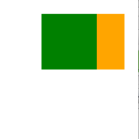
The Item type provides the abilitiy to anchor to other Item types. There are seven anchor lines for each item: left, right, vertical center, top, bottom, baseline and horizontal center. The three vertical anchor lines can be anchored to any of the three vertical anchor lines of another item, and the four horizontal anchor lines can be anchored to the horizontal anchor lines of another item.
For full details, see Positioning with Anchors and the documentation of the anchors property.
import QtQuick
Item {
    width: 200; height: 200

    Rectangle {
        // Anchored to 20px off the top right corner of the parent
        anchors.right: parent.right
        anchors.top: parent.top
        anchors.margins: 20 // Sets all margins at once

        width: 80
        height: 80
        color: "orange"
    }

    Rectangle {
        // Anchored to 20px off the top center corner of the parent.
        // Notice the different group property syntax for 'anchors' compared to
        // the previous Rectangle. Both are valid.
        anchors { horizontalCenter: parent.horizontalCenter; top: parent.top; topMargin: 20 }

        width: 80
        height: 80
        color: "green"
    }
}
Positioners#
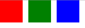
For the common case of wanting to position a set of types in a regular pattern, Qt Quick provides some positioner types. Items placed in a positioner are automatically positioned in some way; for example, a Row positions items to be horizontally adjacent (forming a row).
For full details see Item Positioners.
import QtQuick
Item {
    width: 300; height: 100

    Row { // The "Row" type lays out its child items in a horizontal line
        spacing: 20 // Places 20px of space between items

        Rectangle { width: 80; height: 80; color: "red" }
        Rectangle { width: 80; height: 80; color: "green" }
        Rectangle { width: 80; height: 80; color: "blue" }
    }
}
Layout Types#
Layout types function in a similar way as positioners but allow further refinement or restrictions to the layout. Specifically, the layout types allow you to:
set the alignment of text and other items
resize and fill the allotted application areas automatically
set size constraints such as minimum or maximum dimensions
set the spacing between items within the layout
The snippet above comes from the Basic Layouts example. The snippet shows the simplicity of adding various fields and items in a layout. The GridLayout can be resized and its format is customizable through various properties.
For more information about the layout types, visit:
Qt Quick Layouts Overview
Basic Layouts example
Note
Qt Quick Layouts was introduced in Qt 5.1 and requires Qt Quick 2.1.